Yesterday, I listed reupholstering my desk chair as one of the items on my “to do” list for the office area of my studio. If you’ve been reading my posts for a while, you might remember that this desk chair was originally a dining chair that looked like this…
It didn’t have casters on the legs, and the nailhead trim was silver. So I did a little makeover on the chair by cutting the legs down, adding casters, and then using a little Rub ‘N Buff in a gold/brass color to change the color of the nailhead trim.
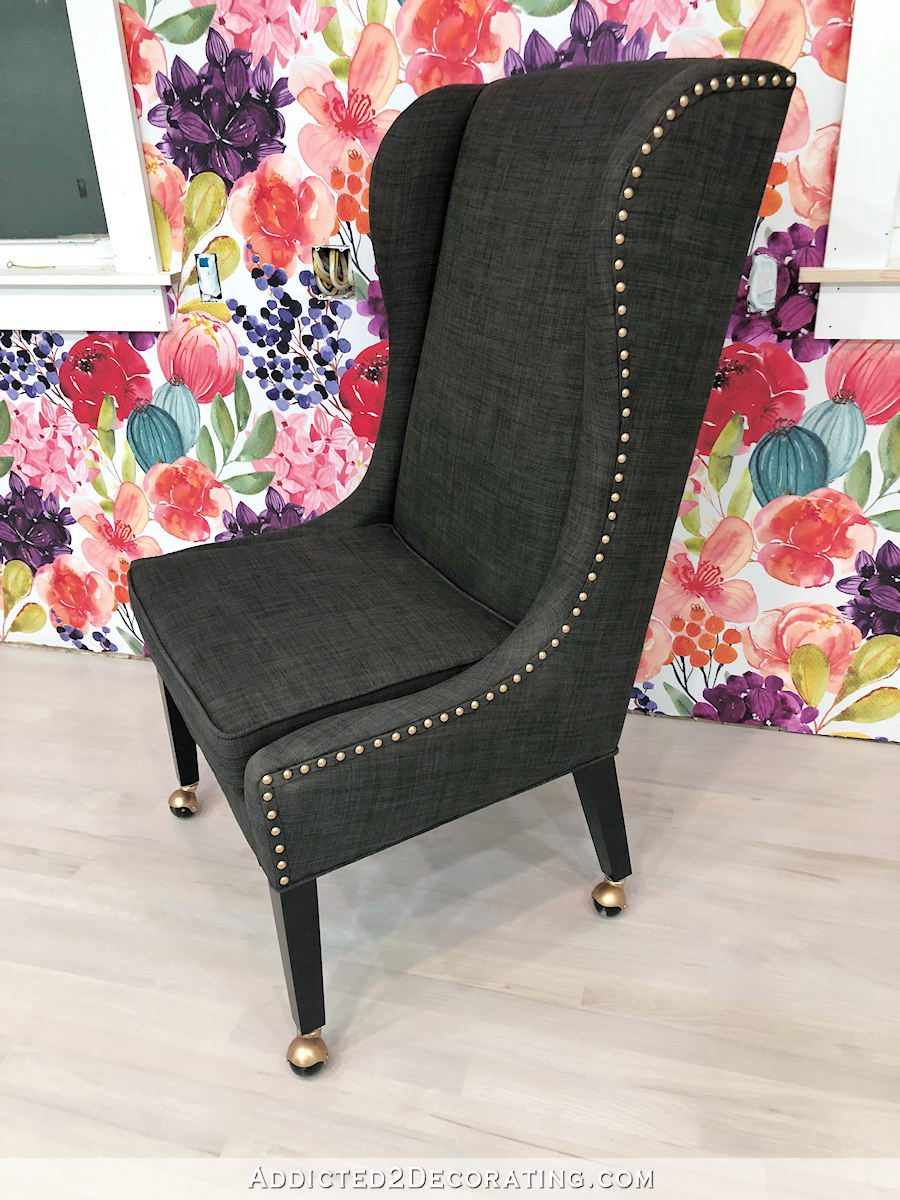
What drew me to this chair in the first place is the really high back. I like a big desk chair that makes a statement. I don’t like small desk chairs that get lost behind the desk. Before buying this one, I had searched and searched for a pretty velvet desk chair in a bold color, and while I found plenty of them, they all had a short back that seemed to barely peek over the desk. So those didn’t fit the bill. I remember finding one that was perfect at Ballard Designs, but it would have been about $1500, and I didn’t really find a fabric from their fabric selection that I loved anyway. I say that as if I’d ever spend $1500 on a desk chair. 😀 I wouldn’t.
So that’s why I’m opting to keep this chair and reupholster it instead of just purchasing a new chair. It’s the perfect size, and it’s actually very comfortable. I love the design, the style, and the size, but I don’t love the color anymore. Plus, as I showed you yesterday, my cat has done a bit of redesigning on it for me.

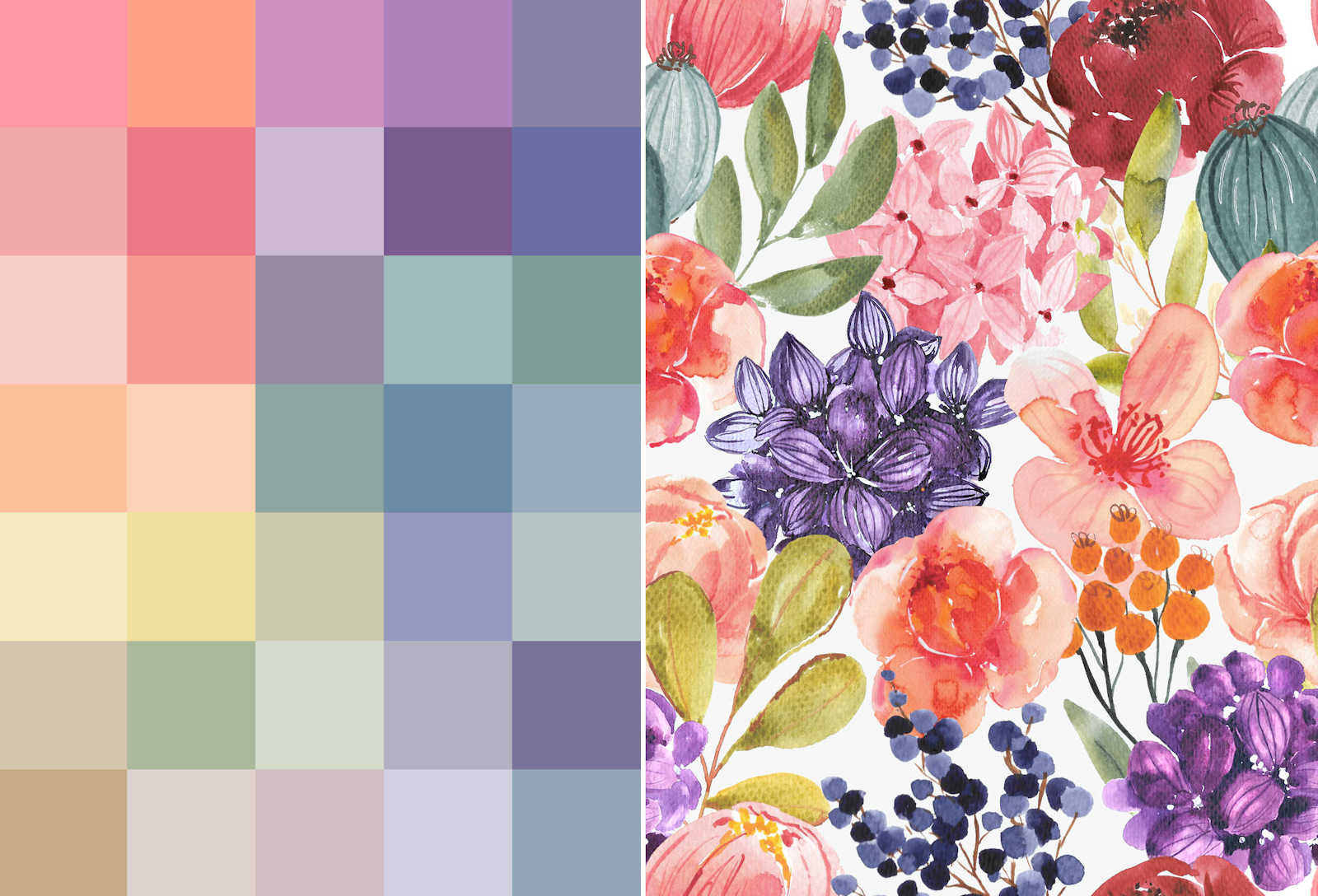
So I need to reupholster it in a cat-proof fabric, and velvet is always my go-to fabric for that. I checked on Spoonflower (the same place where I had my floral mural wallpaper, the floral curtain fabric, and the colorful square wallpaper printed), and they do offer a performance velvet that can be used for upholstery. So I started playing around with a couple of ideas.
First, I tried doing some stripes using the colors from the floral design, which I also used on the square wallpaper design. Here’s a (very rough) mock up of what that could look like…

I added the stripe on the back and the seat, and then did the rest in a solid eggplant color. I’m not sure about doing the entire chair in the stripe. My first thought is that it might be overwhelming and busy. My second thought is that trying to match those stripes would be a nightmare, and might end up looking very sloppy. But I could do horizontal stripes on the back and seat cushion, and then vertical stripes on the rest so that they’re very intentionally different, and wouldn’t require matching up the stripes from one section to another. I didn’t do a mock up of that idea, though, because I’m just not that good at doing mockups.
The second idea I tried was using the same colorful square design that I made for the studio bathroom wallpaper. I can have that same design (but probably with smaller squares) printed on fabric. That would look something like this…

Again, I paired it with a dark eggplant color for the sides. And the chair in those pictures is sitting in front of the old, original wallpaper that had the smaller, darker flowers. If you’ll remember, when I decided to go with the larger flowers, I also lightened the colors on some of the flowers quite a bit. But the new wallpaper isn’t so drastically different in color that it would affect what goes on the chair across the room.
So those are the two options I’m toying around with right now. I might play around with those stripes a little more and try out some various edits, like perhaps doing the stripe vertically instead of horizontally, or using fewer colors with wider stripes.
But just based on the two options I’ve done so far, I think the fabric with the colorful squares is my favorite. My only concern is that I might be getting a little heavy on the squares and rectangles. My floor is painted squares. The bathroom walls will be covered in colorful squares. The paint swatch cabinet is covered in colorful rectangles.
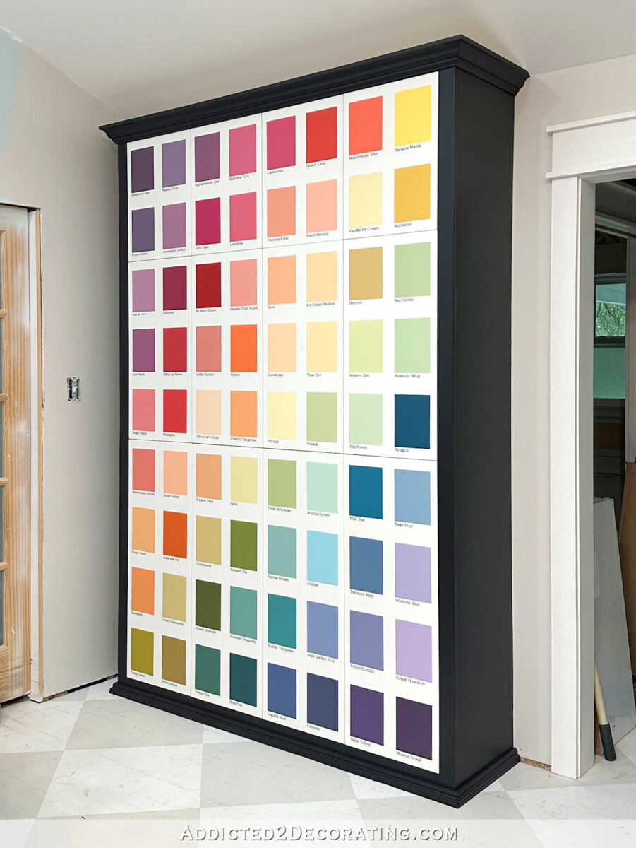
And then I bought a huge colorful wall calendar to go on the wall next to my desk. I haven’t shown y’all the wall calendar yet, but it’s this one from Kaleidoscope Living. It’s huge, and glorious, and colorful, and amazing…and more rectangles.
I feel like the room is already getting pretty heavy on the colorful squares/rectangles, and that makes me think I need to make the stripes work, even if they’re my second choice. But we’ll see. I may end up throwing caution to the wind and adding more colorful squares.
Addicted 2 Decorating is where I share my DIY and decorating journey as I remodel and decorate the 1948 fixer upper that my husband, Matt, and I bought in 2013. Matt has M.S. and is unable to do physical work, so I do the majority of the work on the house by myself. You can learn more about me here.


