Common Design Mistakes 1 – 5: The Biggest Offenders
Below are the first five of the top ten most common design mistakes that waste space. The second five will be posted June 1st. Surprisingly, both professionals and non-professionals make these space wasting errors when building or remodeling a home. Often these design choices reduce usable space instead of increasing it.
1- French doors
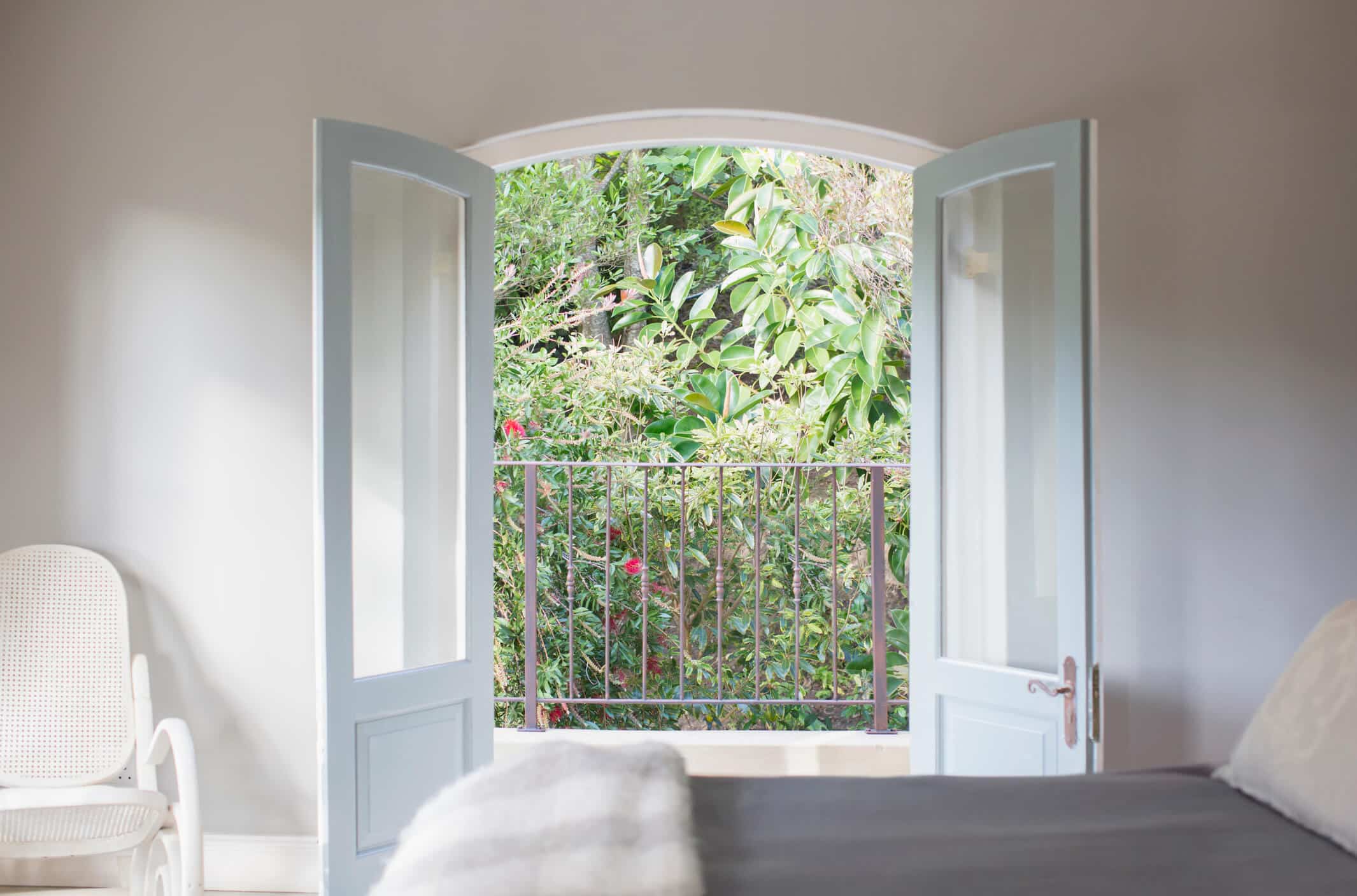
The most common design mistake. Everyone loves French doors, especially architects. However, many fail to consider the large loss of usable space. Compared to sliding glass doors, French doors eliminate space both inside and outside. Furniture can not be put on either side of French doors because they will only open fully if they’re folded back against the walls to be out of the way. The same is the case, outside, for the screen doors that open out the same way. There’s an additional issue with steps below the doors. An entire landing must be created so that people can open the doors safely coming inside. Sliding doors do come in French styles so the look is available without the loss of a lot of space.
2- Stackable washers and dryers
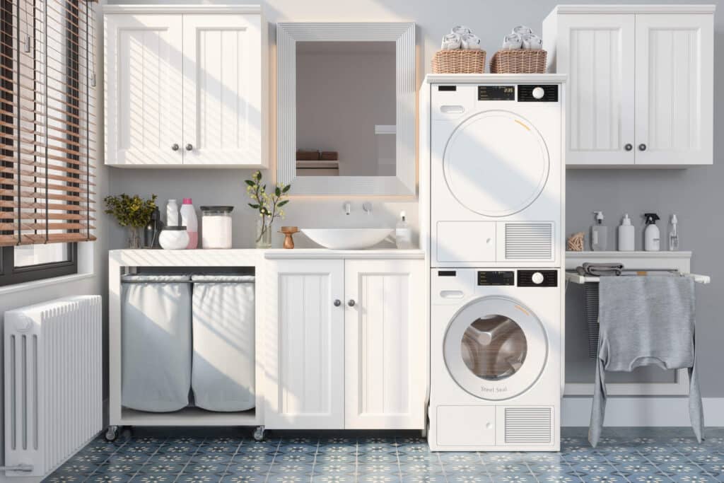
Most people mistakenly assume stacking washers and dryers save space. But using a sink like the one pictured above is quite cramped with a tall deep appliance column against your right elbow. Alternatively, putting both appliances under a countertop with an additional wall cabinet or closet bar above makes a much more functional space. Clothes can be folded on the countertop and using the sink is no longer problematic. And you also get additional storage or being able to hang shirts and other clothes above the countertop. Stacked appliances are not space savers. This is why we consider using stackable washers this way a common design mistake.
3 – Washer dryer pedestals
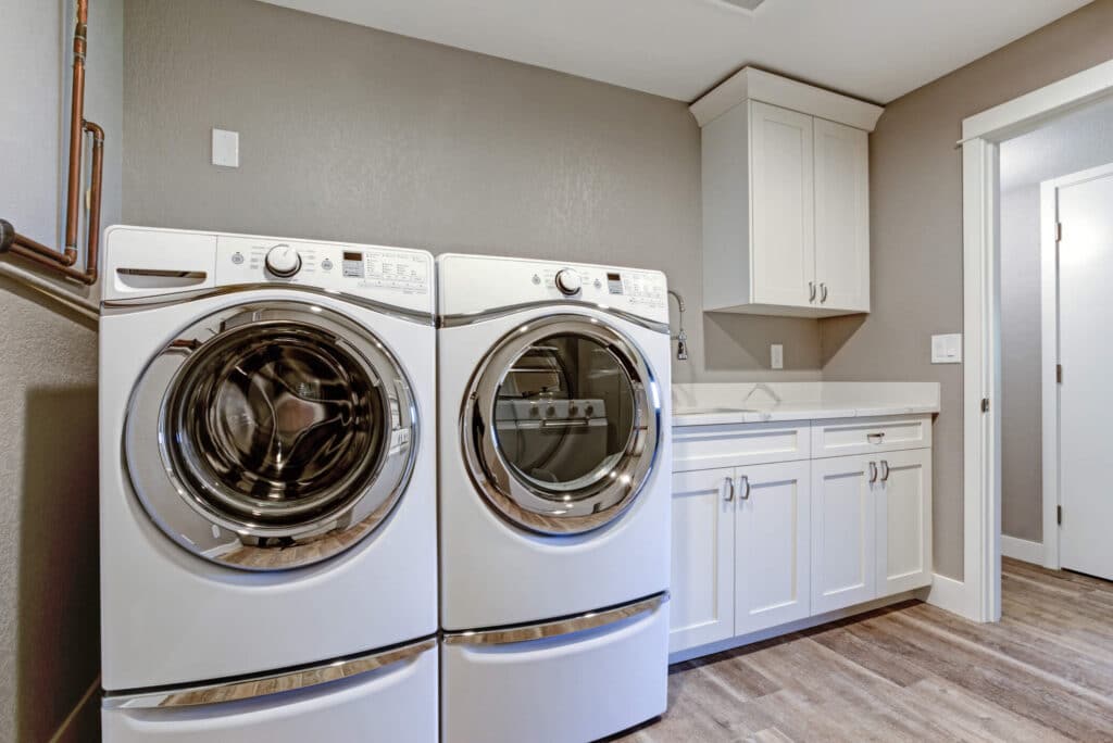
Washer dryer pedestals allow people to bend over less doing laundry. However they eliminate the most amount of usable space in a laundry room as nothing above them is easily accessible. The drawers that you get below do not nearly compensate for the countertop and wall cabinets that would have been possible without the pedestals. It always surprises me that homeowners have trouble weighing the cost/benefits of these space killers.
4 – Walk-in Pantry
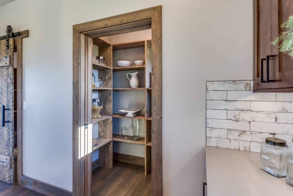
Walk-in pantries are another architect favorite and often a “must have” for possibly misguided homeowners. They can work in very large homes but as the home and the pantry itself get smaller, walk-in storage loses any advantage. For example, in the above pantry, the access area requires more space than the shelving storage itself. Simply reconfiguring this same pantry to 2 foot deep shelving accessed from double width doors inside the kitchen provides for the amount of storage PLUS an equally deep closet created in the back of the new pantry and accessible from the room next door. If more space is lost walking into a pantry than the pantry storage itself, it qualifies as a common design mistake.
5 – Double Bowl Sinks
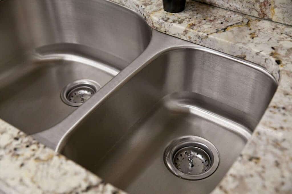
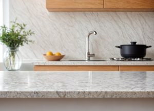
Double bowl or bowl and a half sinks are a poor decision unless you are planning a Kosher kitchen and must have two distinct sinks. They actually became outdated in the 1960’s – have you seen one at a homeshow or in a kitchen show room? The photo above is a standard double bowl sink but neither sink is as large as a small single apartment size sink. Washing cookie sheets, cutting boards, and roasting pans are just a few of the tasks that are nearly impossible in double bowl sinks. A larger, single bowl sink makes cleaning is much more manageable and the kitchen less messy looking when items are in it before cleanup.
Another important note for those who think that washing their dishes by hand saves water and energy. Today’s dishwashers use less water than hand washing, and almost all the mechanical energy used in a dishwasher comes from water pressure. In Pennsylvania, the energy cost to wash dishes in the dishwasher every two days is less than $25 A YEAR?!
