There’s a lot to consider when designing a kitchen.
Designing a kitchen well means moving appliances, sinks, cabinetry and even walls around to promote a more functional kitchen. It also means making the design as attractive as possible in the style that your customer prefers. One of the most important tests determining how well a kitchen is designed is the countertop test.
Becoming good at kitchen designing takes years of experience and an unusually good grasp of spacial relations. Obeying simple design rules like the “kitchen work triangle” between your sink, range, and refrigerator will help avoid the worst floor plans. Beyond that, the primary kitchen design rules are too simplistic to find the great kitchen that is hidden in any particular space. One way to evaluate how well a kitchen is designed is Main Line Kitchen Design’s countertop test.
Our countertop test evaluates how well a kitchen is designed by analyzing how often kitchen countertop is used.
Imagine if we were to create a drawing of the shape of your countertop. Next, we shaded that drawing from white to red according to how often the countertop was used. If the countertop was used frequently, it would be shaded red. If it was hardly ever used it would remain white. Using this technique, a well-designed kitchen would have pink countertops showing that all the countertop in the kitchen was being used. A poorly designed kitchen would have a bright red spot between the sink and the range. All the rest of the countertop would be nearly white.
Let’s look at two countertop test examples:
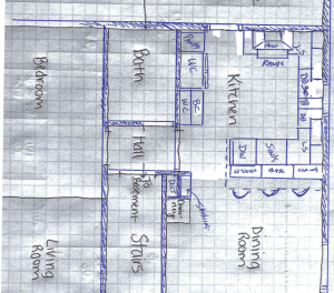
Look carefully at the kitchen in the photo above. Think about how the countertop here will be used.
Imagine you are cooking at the cooktop. The countertop both left and right of the cooktop is only 12″ wide and too narrow to stand in front of and cut and chop. In fact, the countertop on the left of the cooktop will be covered by the refrigerator door every time it is opened. When the refrigerator is open the person putting things away or taking them out also won’t be able to use the counter that the door to the refrigerator is covering! The only place to work at or place things conveniently on the countertop close the cook top and refrigerator is the countertop left of the sink.
This means that a drain board or drying area will have to be to the right of the sink. So, people working at the sink will also want to use the countertop left of the sink. All the countertop on the peninsula in this kitchen is too far away from someone cooking to be convenient using, and the person at the sink will be forced to bypass the drain board every time they go to the peninsula. The peninsula may get used making sandwiches, but it isn’t where you need the greatest amount of top in your kitchen.
This kitchen is a perfect example of a poorly designed kitchen. Using the shading technique there would be one bright red area of countertop left of the sink and everywhere else the countertop would either be shaded lightly or not at all.
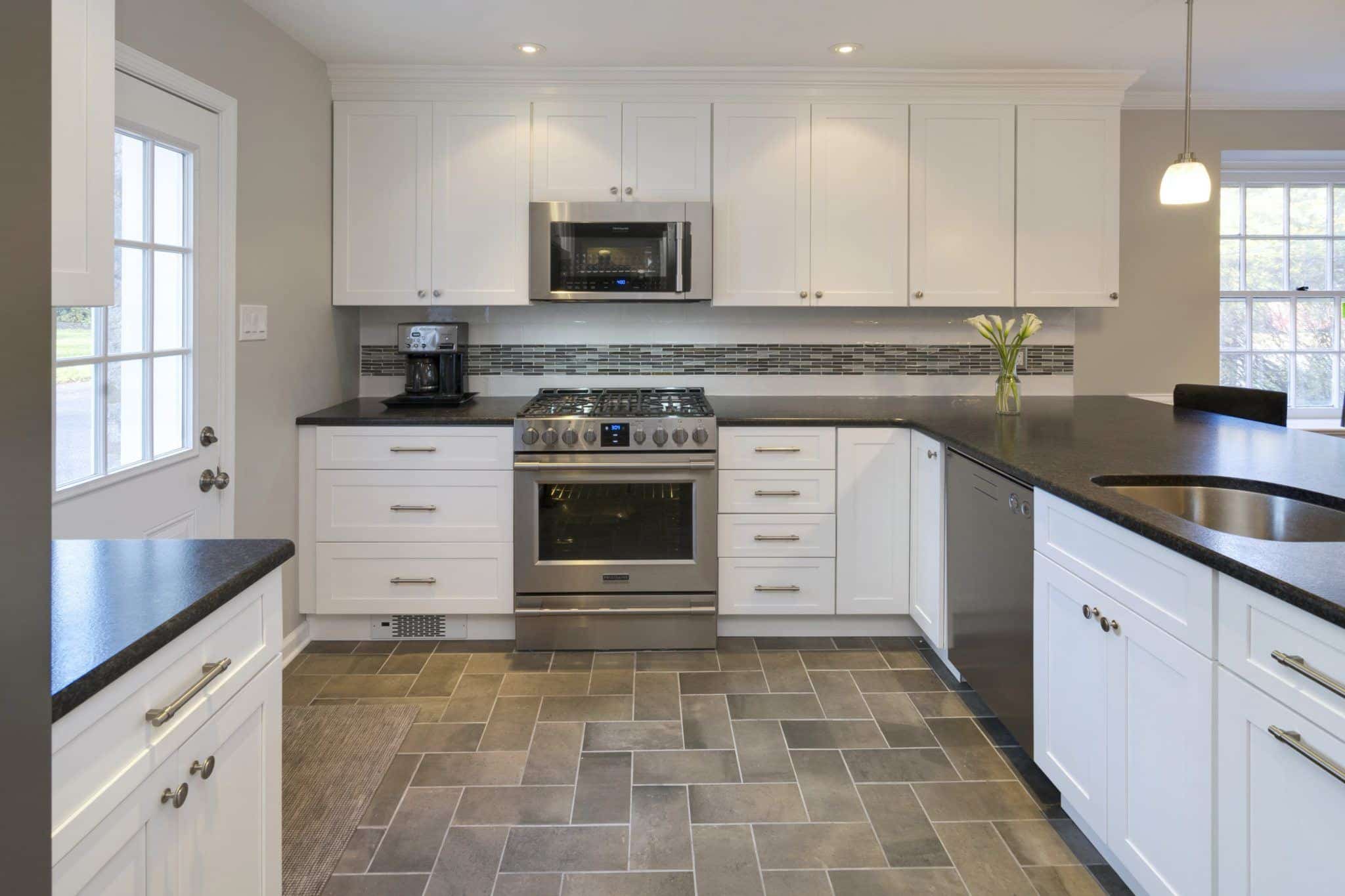
Now look at a kitchen with a similar amount of countertop designed by Main Line Kitchen Design.
Notice in the kitchen above that the countertop both left and right of the range is wide enough to comfortably work at.
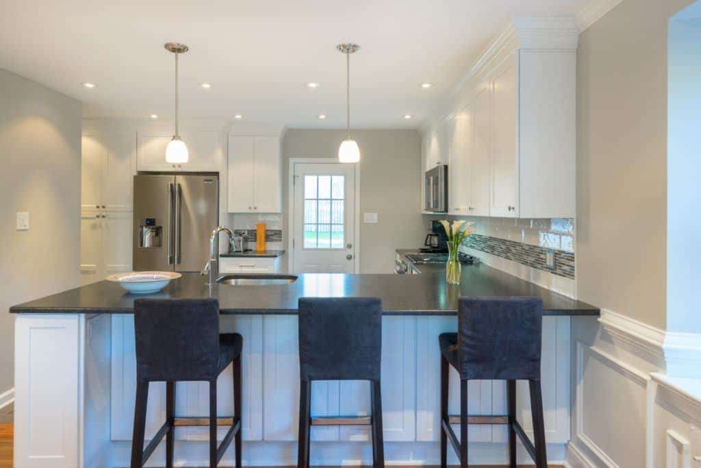
The countertop left of the sink has an expanse of countertop that can be worked at and the area right of the sink is not very narrow. The refrigerator is in a separate area with countertop of its own, and while the refrigerator door is open only a portion of the countertop will be covered by the refrigerator door and the peninsula in back of the refrigerator is also close enough to be useful loading and unloading the refrigerator.
The peninsula is also serving double duty for the people sitting at the peninsula. Shading this countertop according to how often the countertop will be used will show a completely pink top with some areas slightly darker than others.
Creating this design required closing a window that was formerly above the range, relocating all three of the “kitchen’s triangle” components and removing the wall between the kitchen and dining room.
However, the added construction costs to make these changes was only about $4,000 and so about 10% of the total cost of the project, money well spent in my opinion. Some customers will spend that much money just upgrading their range to a professional range or their refrigerator to a Subzero. Those changes while nice have a very limited impact on the overall beauty and function of a kitchen.
Our Kitchen Design Process | Main Line Kitchen Design
Check out our Houzz.com page to see photos of over a hundred Main Line Kitchen Design projects.
Hopping your countertop is “all pink” . . .
and of course . . .
Bon Appetit!
Paul

