Yesterday, I just wasn’t in the mood to work on baseboards or door casings, so I decided to do a fun project. I was determined to figure out the arrangement for the one big, blank wall in the studio. Spoiler alert: I didn’t figure it out, and I didn’t get it finished. But I did make some progress that might make it easier for me to decide exactly what I want to do. Let me explain.
A couple of months ago, I purchased this huge, colorful, erasable wall calendar from Kaleidoscope Living. And when I say it’s huge, I mean it’s HUGE. Each month is 16″ x 20″, so if you hang all 12 at one time, the whole calendar will take up a very large area of wall. And yes, I do want to hang all 12 months at the same time. I love the impact of seeing all 12 together.
The calendar is printed on some pretty thick paper, but I wanted mine to be more rigid than that. So I purchased 12 pieces of white foam core board at Michael’s, along with some photo mount spray adhesive, and I got busy.
This is the spray I used.
I sprayed two coats of adhesive onto the foam core board, let it dry for a couple of minutes, and then carefully pressed the calendar to the foam core board.
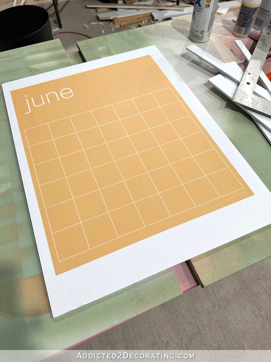
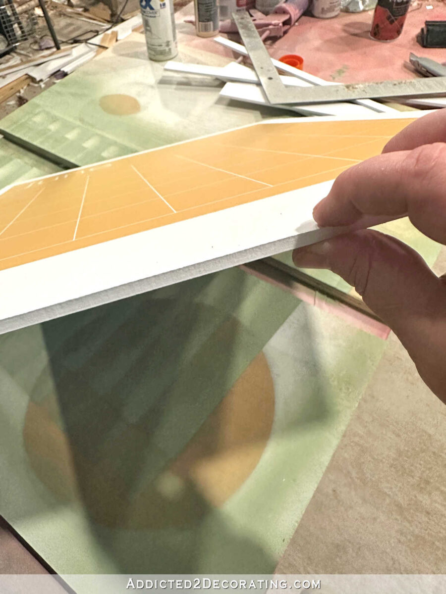
You can see how much thickness the foam core board added, but it is styrofoam, so it’s very easy to cut.
Using a metal straight edge and a brand new razor blade in my utility knife, I began cutting away the excess foam core board.
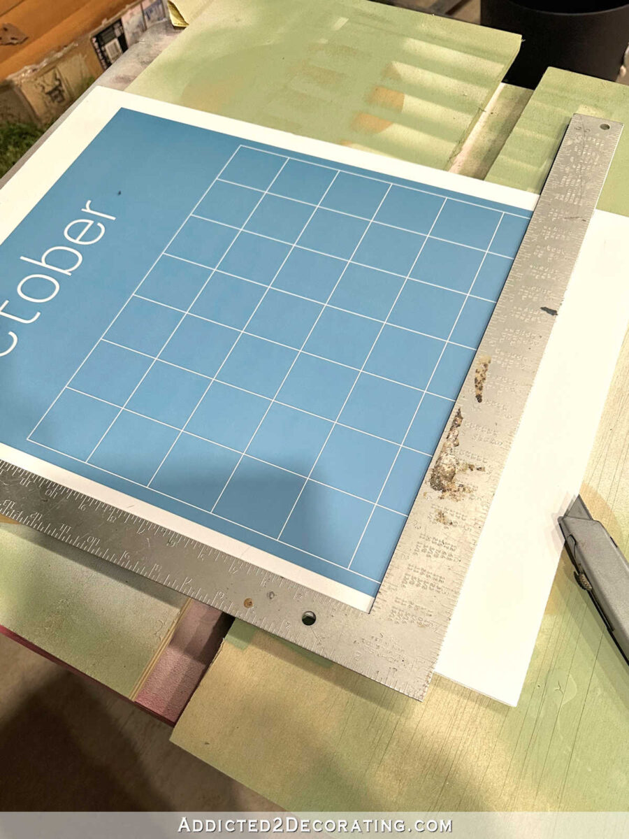
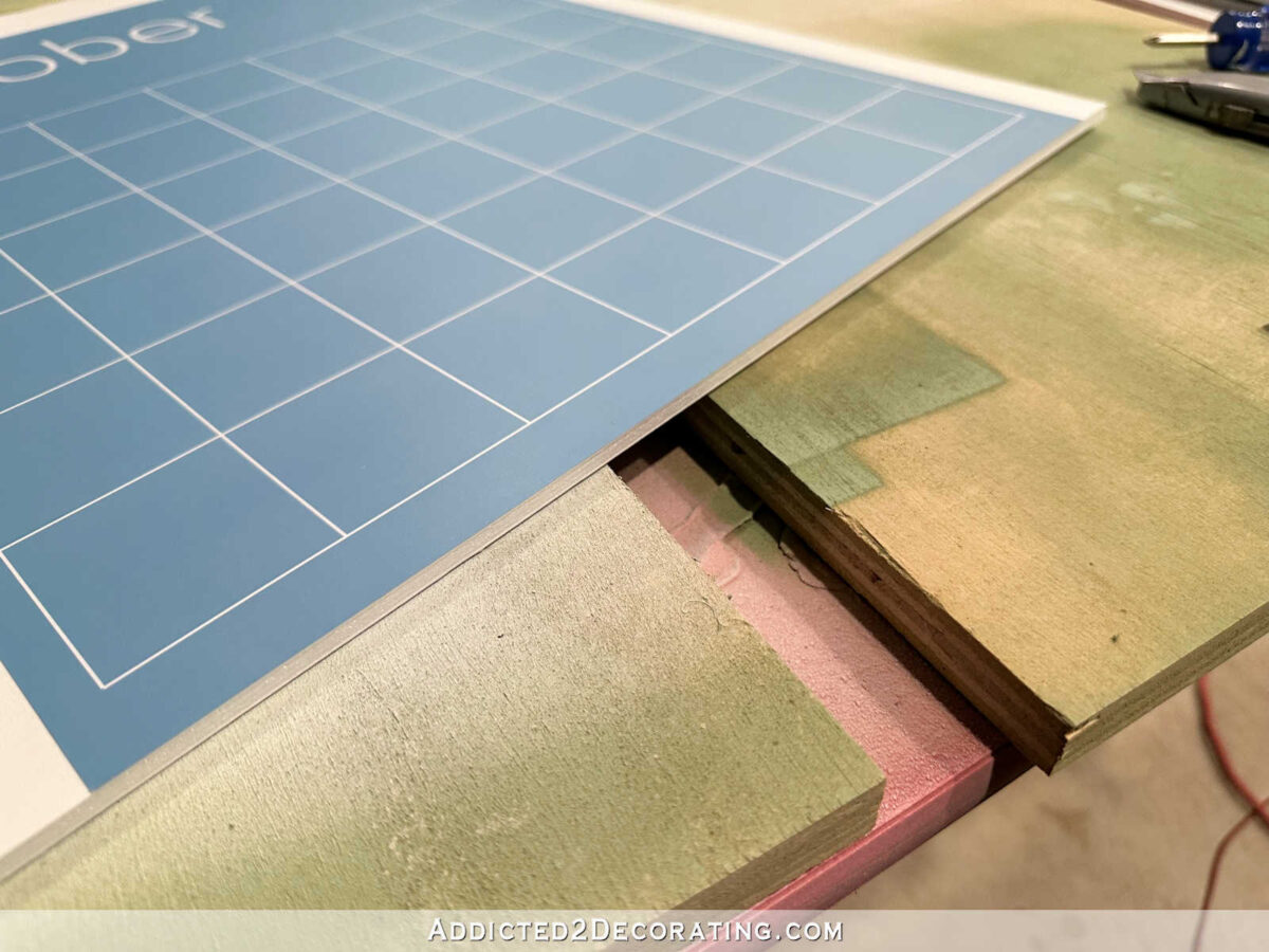
I went through three razor blades to do all 12 months because I wanted these super clean cuts. I didn’t want to take a chance at the blade getting dull and tearing the foam core board. But as long as the blade was new and sharp, the cuts were clean and easy.
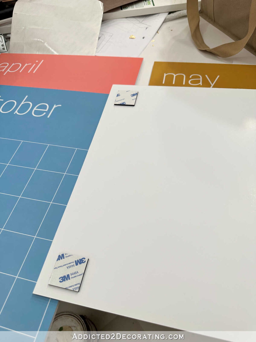
After I got all 12 mounted and trimmed, I added four 3M foam sticky squares to the backs of each month.
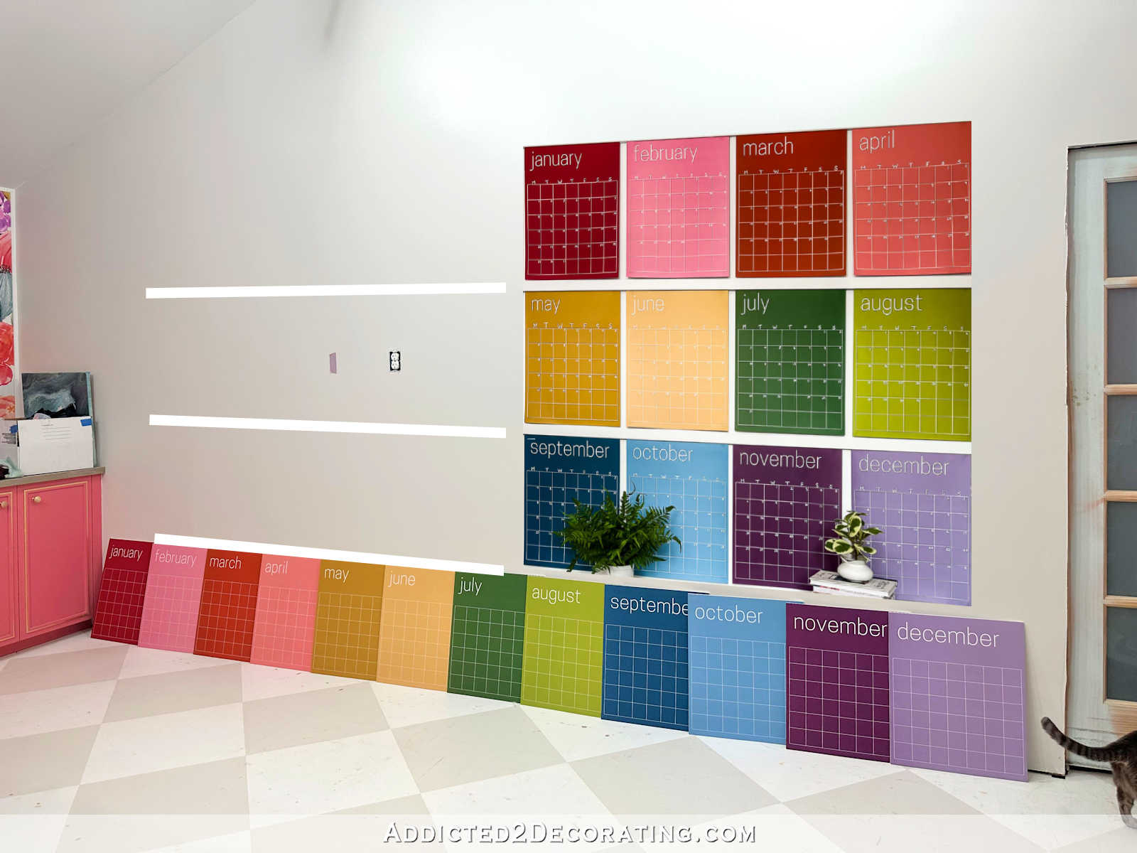
And that’s as far as I got. I thought I had a plan, but then I realized that I didn’t like my plan at all. My original plan included a 55-inch TV centered on that wall between the front of the mural wall cabinets and the door casing (which hasn’t been installed yet) on the right. I haven’t bought the TV yet, but this is what a 55-inch TV would look like on that wall.
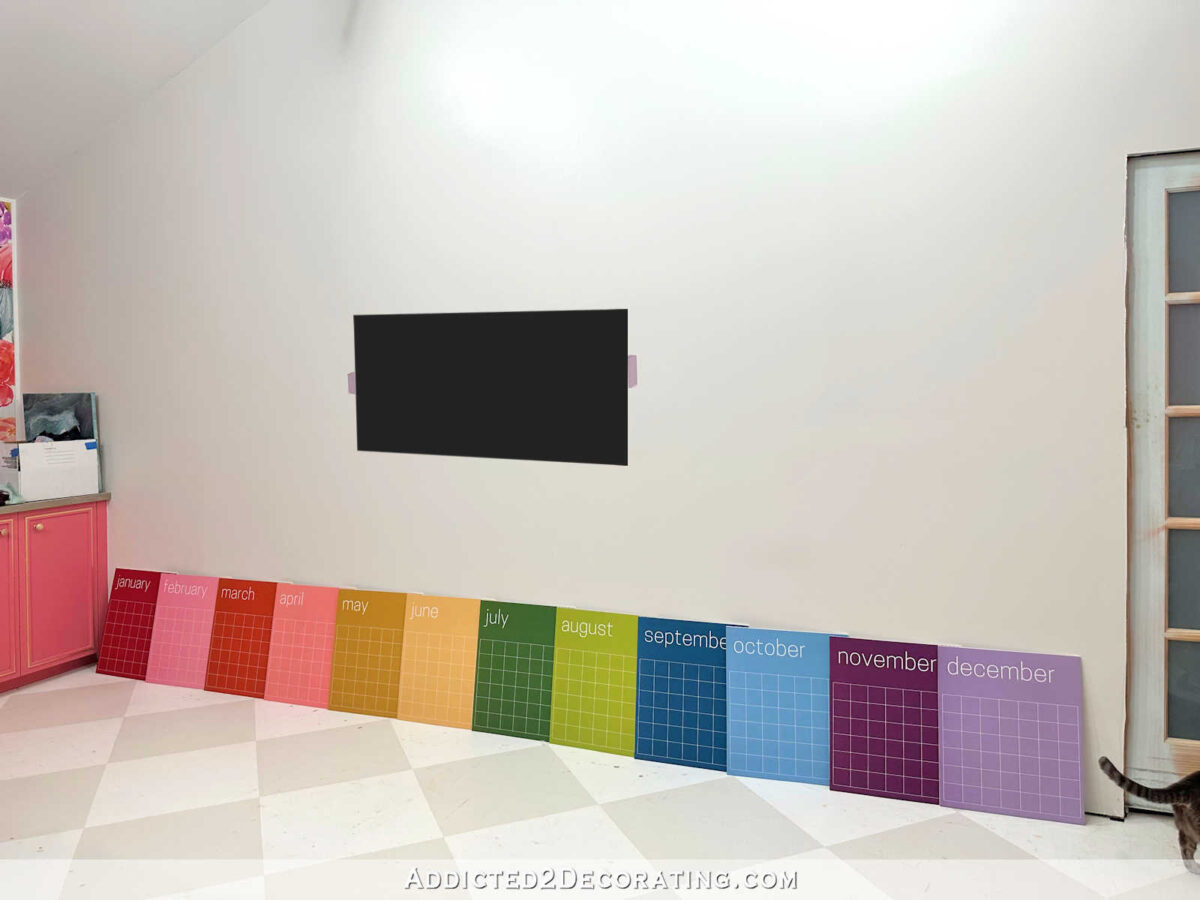
With the TV in the middle, I then planned to split the calendar into two sections with six months on each side of the TV. But the more I thought about it and pictured it in my mind, the more I wasn’t sold on that plan.
And then I wondered if I even need a TV in this room. Back when I was planning the room (way before the drywall even went up, which was several years ago), I planned for a TV on this wall, which is why there’s an outlet right there in the middle. But I just don’t watch much TV anymore. I listen to podcasts and YouTube videos just about all day long as I’m working. So now I’m second-guessing my plan to put a TV in here at all.
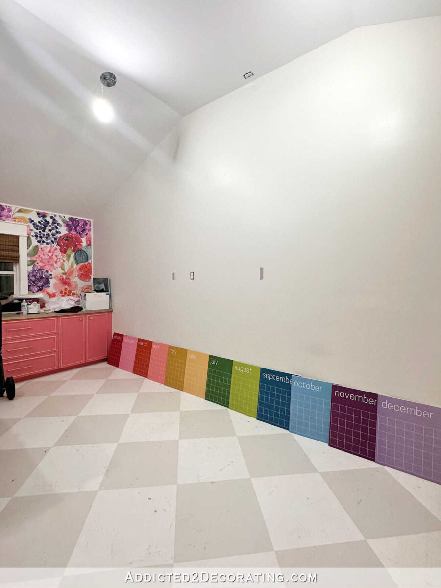
So because I don’t really watch TV at all during the day, and I don’t really have a need for it in here, plus the fact that I can’t figure out how to work it into the wall design, means that I’ll probably just forgo the TV altogether. But then that leaves the outlet that I have to work around. The position of that outlet makes it very difficult to center the calendar on the wall.
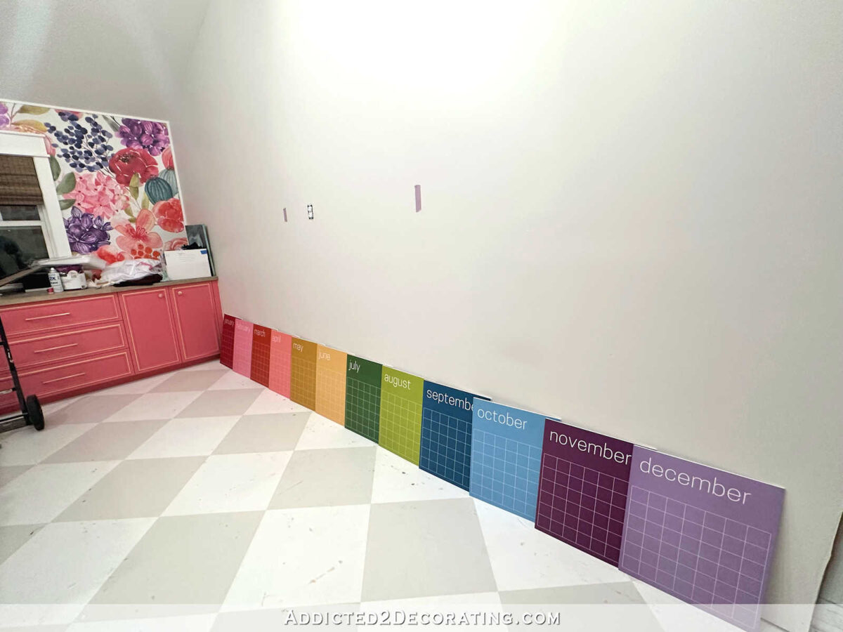
So now I’m considering something like this arrangement, with the calendar offset on the right side, and some shelves on the left to balance things out. (Note: I don’t have two calendars. The one “hanging” on the wall is a copy and paste from the Kaleidoscope Living product listing, which is why there are two random plants along the bottom. 😀 The ones lined up on the floor are the real ones that are actually sitting in my studio right now.)

Out of the options that I’ve considered for this wall, this one is my favorite so far. But as usual, I’m open to ideas. If not shelves, what else? I’ve decided not to use my Spoonflower color chart, either. At least, I think I’ve decided that. It seem to be bordering on square/rectangle overload with the calendar, the paint swatch cabinet to the right of the door, and then the color swatch chart. So I’m needing some other ideas.
Addicted 2 Decorating is where I share my DIY and decorating journey as I remodel and decorate the 1948 fixer upper that my husband, Matt, and I bought in 2013. Matt has M.S. and is unable to do physical work, so I do the majority of the work on the house by myself. You can learn more about me here.
